
RecargaPay is a mobile payment and digital wallet application that has been revolutionizing the way people conduct their financial transactions. With this app, users can easily top-up their mobile phones, pay bills, and make online and offline purchases.
I enthusiastically share my journey in the conception and enhancement of the “Public Transport Card Top-Up“.
The context of an increasingly connected and dynamic world, an opportunity arose to provide users with an even more convenient. This led to the challenge of improving the Transport Services within the application.
 Little variety of recharge types.

What's the problem?
During the analysis of this product, I identified several critical issues that were negatively impacting the overall user experience.
For that was required a holistic approach, involving a deep understanding of user pain points.
- 😒 The purchasing transport top-ups were not treated individually, This limited purchases and resulted losing potential loyal users.
- 🤬 I noticed a significant number of user complaints regarding their experience with the application.
- 🤔 I identified a lack of information and communication; users were not informed clearly during their app experience.

Solutions
Make everyday life easier for consumers by offering more convenience and practicality when recharging their public transport credits. Taking into account determining factors for the final conversion. These are consumption scenarios, varied types of recharges, and solving doubts to avoid chat.
- 🦄 Understand the variety of products and handle the sales system individually.
- 👩🏫 Providing information on demand, this means allowing the user to access information according to need.
- 🕵️♀️ Analyze the complaints index and identify systemic problems and possible communication failures.
Wokflow
In this flow, you can see in a simplified way how the design of this product was in a macro view of how the intelligence behind this sales system works.
Conclusion
Throughout the iterative design process, we conducted regular usability testing sessions to validate design decisions and ensure that each improvement resonated with the end-users. As a result of these concerted efforts, the product underwent a significant transformation. It became more user-friendly. It also brought positive results for the company in general.
NPS
10% increase in the Net Promoter Score
Conversion
Rate increased from 6% to 11%
Tickets
Less problems, less attendance.
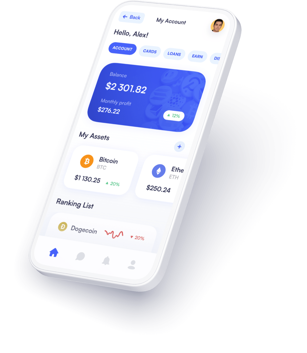
Screen Appreciation
See in detail the main screens of this project!


Important Note:
This portfolio aims to share my professional experiences. To protect the commercial interests of the organizations involved, sensitive information such as business rules and security systems has been omitted or generalized.